Since the earliest iPhone photo apps, iPhonegraphers have been searching for “Photoshop for the iPhone.” For a long time, not even the actual Photoshop for iOS could claim that honor. Leonardo is a powerful new image editing app with many advanced features not found in other image editors.
With the recent App Store deletion of PhotoForge2, there is definitely a big hole in the high-end iOS image editing market right now. How does Leonardo stack up? It’s very impressive, but….
Keep reading to see what I think. >>>
 Leonardo is a Universal app. It’s designed to take advantage of the screen of the device it’s on, which means its tools and menus will layout differently whether it’s on an iPhone or an iPad. As this blog mainly deals in iPhoneography, for the sake of this review, I’ll be talking about Leonardo and how it works on an iPhone 5. This is important.
Leonardo is one of the more full-featured and ambitious image editors I’ve found yet for iPhone. In addition to all of the standard image editing tools, it has a lot of the high-end editing and creating tools. On paper (in pixels?), Leonardo compares favorably with desktop photo editors. The tools and features of Leonardo are very impressive and you have to dig into the app to fully appreciate what’s there. Leonardo is not a toy. It’s a powerful image editor.
Leonardo has some of my favorite advanced tools from Photoshop for desktop, including versatile and powerful masking tools and power-user adjustment tools. Some of these tools appear scattered in other photo apps. Many of these are the tools I use on the desktop when making precision color moves, retouching, and compositing. It’s convenient to have them all in one app.
If you are familiar with the toolset of Photoshop for desktop, you’ll have an easier time finding and identifying Leonardo’s tools. If you don’t work in Photoshop or Lightroom, there’s a good chance you’ll have a more difficult time getting the hang of some of the app’s more advanced tools.
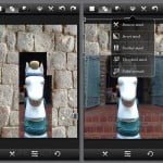
On the surface, the user interface of Leonardo is straightforward. The basic tool groups are arranged in icons at the foot of the screen. The top of the main screen contains a row of operational icons. This is a good layout that keeps the two different sets of menus separate.
Editing
All the tools you expect in an advanced image editor are here in Leonardo, as well as a bunch of well-done, useful color and grayscale presets. These presets are one-click and are stackable, but not editable beyond adjusting the intensity of each effect. You can’t use these presets as a starting point for your edits and tweak them.
The light leaks are pretty slick in that they are a combination of preset overlays but with complete control over position, rotation and scale. Moving, pinching, and rotating gives you unlimited options with the light leaks feature.
The focus of Leonardo is not so much in the one-click filters, but more in the powerful Photoshop-like image editing capabilities of the app.
You can pretty much make any basic or advanced color moves with Leonardo. All the tools you likely to need on an iOS device and many of the advanced ones from Photoshop — Curves, Histograms, Exposure, Contrast, Hue, Saturation, Clarity, Blur, Vignette, Color Balance, Sharpness and many more. Tweaks and adjustments preview onscreen in real time. The app lacks an Edited/Original preview toggle. While not essential, I find such a tool is more useful than the Undo/Redo buttons.
Two of my favorite tools from Photoshop are here — Color Balance and Shadows & Highlights. Color Balance lets you make precise color moves to either correct or radically change a color. Shadows & Highlights lets you easily recover dark and light areas from an image. It restores detail in shadows and can restore some weight and detail back into blown-out highlights.
If you’ve used a Clone tool in Photoshop, you’ll feel right at home using Leonardo’s. Setting the clone source is as easy as dragging a target. Brush size and hardness are easily adjustable. It’s a great tool for removing items, glitches, or blemishes from a photo and it’s well done here.
The app has excellent selection tools — among the best available in iOS. Tools range from Magic Wand to a color range tool that’s similar to Photoshop’s Select > Color Range tool. You can brush, lasso or grab selections. It’s very comprehensive.
Layers and Masking
The app has excellent Layers and Masking features — among the best for iOS. These are full-functioned layers and masks that really give you a lot of power in making selective edits, blends and composites.
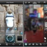
I really like Leonardo’s Layers. They are easy to use, create, move and manage. To reorder them, simply press, hold and drag in the slideaway layers menu. Visibility is easily toggled on and off and is clearly labeled. There’s a great button that quickly turns off all but the current layer, making edits and masking easier.
Implementation of Masks differs from Photoshop in some ways. All the functionality is there, but the implementation has been adapted to the menuless interface of iOS. Once you learn where all of the commands are, Masks are easy to create, add to, subtract from, invert, and remove.
I love that Leonardo’s Layers and Masks let you do some — some — edits that are non-destructive. In addition to easily (but painstakingly) be able to make creative composites and blends, you can also use duplicate layers and masks to perform very precise color moves on specific parts of your image. For instance, you can mask out a dark area of a photo, fix it with curves and Leonardo’s excellent Shadows/Highlights tool without affecting any of the well-lit parts of the photo.
Leonardo’s “Quirks”
I really like the capabilities of Leonardo. It’s a very ambitious app with an excellent toolset. Unfortunately, I found the toolset to be very frustrating in its implementation and this for me is where the app needs a lot of work.
The entire user interface seems sticky and non-responsive. Some sliders are slow to respond. Others are frustratingly sticky. For instance, any slider control that is moved to either edge of the screen in the 0 or 100 positions were difficult to grab to reposition. I’d have to try several times to “grab” them with both my finger and the more precise tip of a stylus. For me, this is very frustrating. I prefer not to fight the UI while I’m making this level of adjustments in a photo app.
Some of the Transparency sliders are buggy. For some tools, the slider opens in the 100% position but previews as 0%. Only jogging the slider slightly fixes this.
While I like the way Layers and Masks are designed and how they are supposed to work, they don’t work smoothly for me much of the time. There is no dedicated move and zoom tool, similar to Photoshop’s Hand tool. In editing mode, to move or zoom the image, you use standard iPhone gestures of a two-finger grab or the pinch and zoom gesture. Leonardo often did not recognize these gestures for me, though, and I found myself making a lot of unwanted edits to my masks when I really just wanted to pan the preview.
Once you’ve painted or selected the area you want to mask, setting the mask is not intuitive. If you watch the tutorial video, you need to select the “X” at the bottom of the screen. The is no check mark. Typically, an X means cancel your edit. This is a bit of very non-intuitive UI design. I wasted 10 minutes to try and figure this one out. Then I watched the tutorial….
The Crop tool is halfway useless. As far as I can tell, it works on the active layer only. It crops one layer at a time which is not how I expect a crop tool to work. In some ways, it’s great for trimming excess data from a layer, but that can be masked out easily. As far as I can tell, in order to crop your entire image, it must first be flattened in the Layers window, removing any further editability of the project. I suppose you could use the app’s Undo feature, but the first thing it’ll undo is the crop itself. Without a History feature, cropping in Leonardo is not intuitive. Having to flatten the image to crop it negates saving a layered file as a project.
As far as I can tell, the Straighten tool works on the active layer only as well, but here it’s a much more useful feature. Either way, having the ability to crop and straighten one layer or all simultaneously should at least be an option.
The User Interface is a little unconventional at times. For instance, the clone, paint and text tools are in the Crop menu, along with Scale, Flip & Rotate, and Straighten. These are tools I’d expect in an Edit menu. The Gaussian Blur tool is in the Adjustments menu, but the Radial Blur and Directional Blur tools are in the FX menu. These quirks aren’t enough to put me off Leonardo on their own, but combined with the stickiness of the masking tools and sliders, add to the frustration of using this app.
The Bottom Line
Leonardo is a very ambitious app. The feature set is really incredible. Especially if you’re a desktop Photoshop user, you will be amazed at the tools that are available in this app.
Leonardo supports image sizes greater than 8 MP. It not only preserves EXIF data, but lets you edit some if it. That’ll clear your iPhone of an app or two.
Where this early version of the app fails for me is the frustration of trying to work in a sticky interface. The very powerful Photoshop Touch, which I’ve seen this app compared to, may not have all of Leonardo’s features but it’s more responsive and more intuitive and that makes it more pleasant to work in.
Leonardo has a steep learning curve. There are several tutorial videos available and I recommend investing the time to view them in order to get the most from this app.
If your iPhoneography workflow can tolerate Leonardo’s quirks, it’s a very impressive app. The tool set is comprehensive and its features are designed as best-in-class. Unfortunately, for iPhone users at least, the app seems to be experiencing some growing pains. Until at least the smoothness and responsiveness of the tools are addressed, I’ll only be using it when I need its advanced features and not as my everyday image editor.
Leonardo has the potential to be a game changer. Time will tell if it adapts to the hardware or the hardware adapts to it.
Again, this review is for iPhone only. iPad users — with a bigger screen — may have a better experience.
Leonardo is $4.99 in the App Store. It’s on sale now for a limited time for $2.99. It’s a Universal app. Requirements: Compatible with iPhone 4, iPhone 4S, iPhone 5, iPod touch (4th generation), iPod touch (5th generation), iPad 2 Wi-Fi, iPad 2 Wi-Fi + 3G, iPad (3rd generation), iPad Wi-Fi + 4G, iPad (4th generation), iPad Wi-Fi + Cellular (4th generation), iPad mini and iPad mini Wi-Fi + Cellular. Requires iOS 5.0 or later. This app is optimized for iPhone 5.
App Store link: Leonardo – Photo Editor with Layer, Selection and Mask
=M=
[hr]
Leonardo Gallery
~~~~
Leonardo 1.0.1
Toolbox
Resolution & Image Quality
User Interface
Price / Value
Powerful
A very impressive app. Its tool set is comprehensive and its features are designed as best-in-class. Sticky sliders, masking issues and other quirks currently make this app frustrating to use on an iPhone.


